Hello, I don’t really understand the power graph on the phone app. Is there an explanation anywhere? I assume that what’s above the line is generation or export yo the grid and what’s below it is import. For yesterday it shows loads of red above the line do it looks like I exported a lot, and very little below so I didn’t import much. That makes sense as we were not at home using anything that day. But the figures at the bottom tell a different story. It says grid import 3901, grid export 4981. And this doesn’t seem to tally with the figures in the energy graph for the same period.
1 Like
I just press the each of the Icons and they either add or remove from the graph, and then just press the correct colour on the graph and it will tell you what is is displaying.
I have an Andriod phone and my figures match - so it might be an iPhone issue - or there have been loads of issues lately with the backend and Stats.
1 Like
Welcome ColinR,
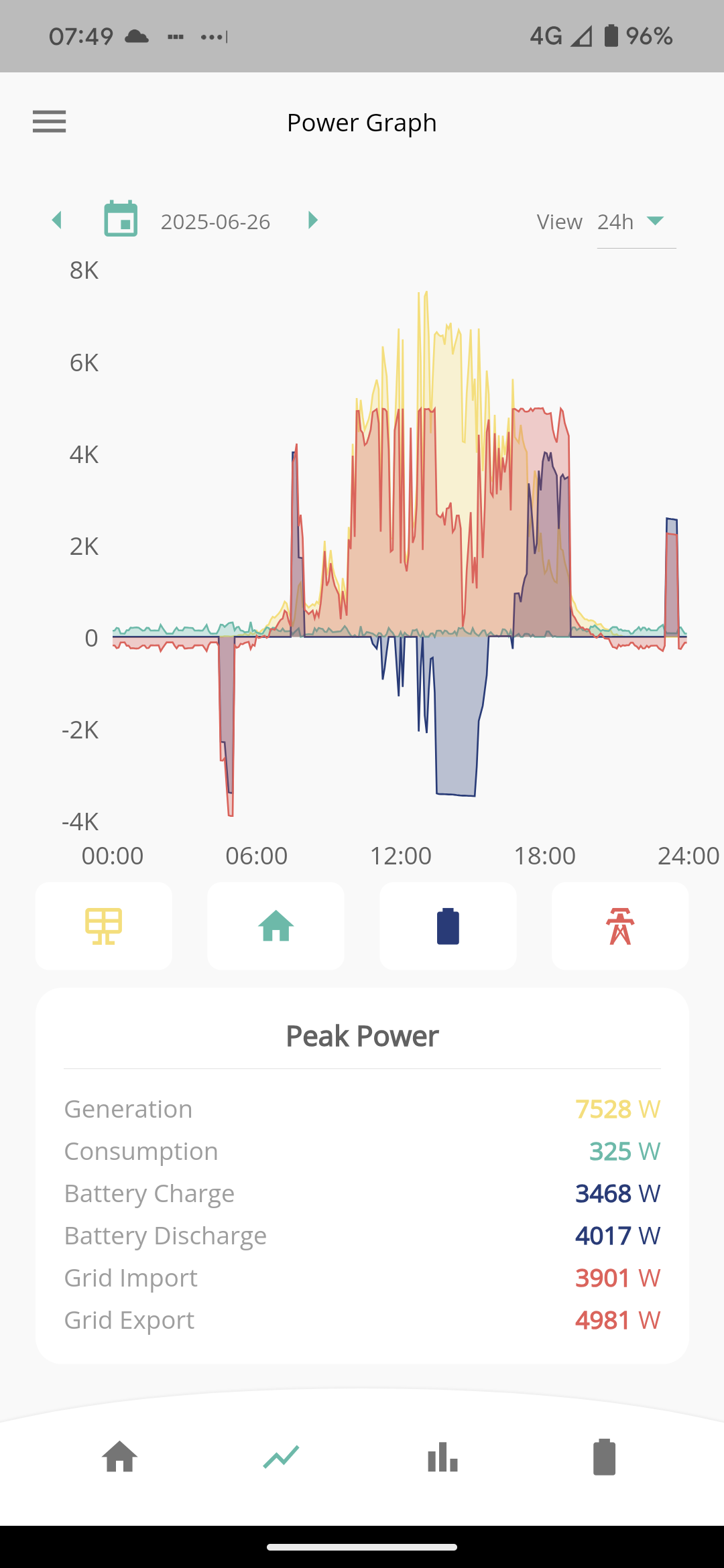
The Power Graph on the App is a record of snapshot values taken once every 5 minutes of Generation, Battery Charge & Discharge, Grid Import & Export. The Consumption value is the remainder from all the other measured values.
As the title says, the Peak Power values are the maximum of the snapshot values for each of the items at any time during the displayed period on the graph.
If you want to compare with your electricity smart meter for import and export you need to be looking at Energy values (kWh) with the most accurate values from GivEnergy being via the web portal (Inverter - Meters section). The App display of Energy is not very accurate because it is based on the snapshot values every 5 minutes which does not take in to account the constantly varying values of power within each 5 minute period.
I hope this helps you.
1 Like