Is anyone else seeing this in their portal or app? Things like huge energy numbers which aren’t reflective of the hourly records or reality. I feel it’s related to the phantom PV production numbers. I have also been getting (which GE still has not fixed).
Has this been going on since install? Or a new issue? If this has been happening from day one it could be meters in the wrong place
It started around the clocks changing, and GE have said there’s a bug in relation to PV generation stats on the energy flow. But this seems to be spreading now.
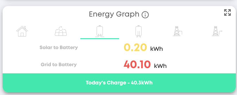
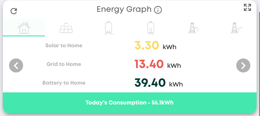
Try using the Energy Graph (Legacy) it should show you the correct figures.
Sorry, I have not seen this before. How do I get there? I am logged into the portal/cloud web interface
I have been getting rubbish data from the portal for over a year now. GE support (an oxymoron) told be back in May that it was a known problem and the development team are working on a fix. They told me the same fiction about a month ago. It’s broken and they don’t know how or don’t want to fix it. I will not recommend GE to anybody right now which is a shame as it worked brilliantly for the first two years.
a shame you’ve been having such an issue for years and they’ve been talking rubbish to you. My installer has stopped supplying GE as they’ve had such trouble. I’ve got both of my inverters being warranties too due to tripping out in the rain and the surface material degrading.
Seriously considering if I can it all replaced. Need to look at my options.
On the Menu bar on the left click on the pencil icon (Edit Your Dashboard). Scroll down to the bottom of the page and click the Add on the Energy Graph (Legacy) card. Click the save icon in the bottom right hand corner. It should take you back to your dashboard.
Yes - I also have this. From memory it has been happening a few months, but it was certainly fine in the height of summer. I notice that the impossible readings also come on the android app.
And yes, I have taken to using the legacy dashboard, which is certainly believable.
However, the results from this are not the same as those in the daily dashboard at the top of the window, so I don’t know which is more accurate…
Click on menu, no pencil icon, ios
My installer has also dropped them. Can’t afford to replace so keep trying to get them to fix it.
The Energy Graph (Legacy) is on the portal not the app. givenergy.cloud
It’s the portal that’s the main problem. For example using either the reports function or the legacy energy graph section to look at last month it shows we used 6240kwh when I know the figure should be somewhere nearer to 600. This is just one example of the rubbish figures. Sometimes it shows we generated a power stations worth of solar. I can no longer (and haven’t been able to for over a year) rely on any figure either in the app or on the portal and GE support just don’t care.
I have a huge peak in solar generation in the middle of the night which is clearly just wrong!
Any ideas?
HI @Grandma this is the same error I’ve been getting. Worth reporting as a support ticket to GE so they know how many users are affected. They know they have a live issue with this.
@NormC thank you so much for this. This looks like the correct totals. Will remove the new energy flow. Why oh why have the messed this up so badly. Shame the app won’t be able to use that information, too.
My understanding is that all the issues with the portal graphs is just with the graphs and charts. The underlying data is OK so if you look at that you can either download it into a spreadsheet or copy the key data you need. e.g. Solar total generation on 30th November - Solar total generation on 31st August.
It is a pain that the graphs don’t work and they’re still not fixed
@geoffrey and of course this causes the data in the app to be entirely wrong, which is probably how most customers interact with their GE system on a daily basis.
Interesting the data itself if downloaded is likely to be correct. I was hoping to do a “first year” summary at the end of March 26 - but given the latest issues I thought my plans had been scuppered. If the data is still intact I can do that again. I expect it can bring down my payoff time.
I’ve never found any issues with the raw data sent by the inverter to the portal, its just the graphs in the app and the portal that are wrong, and I think the Android app is more wrong but this may be false information!
If you want to download the raw data, you can do that, there is a button on the meter data screen to do that, unfortunately its one day at a time.
I use these powershell scripts GitHub - roberttidey/GivEnergyScripts: Scripts for GivEnergyAPI to download bulk data. Have a read of the readme, there are several scripts provided, but I have only needed to use the ‘GEFullDataPoints’ script
oh that’s interesting. pretty difficult to do a bulk download then!
I’ll have a look when it comes to it.
Really think it shouldn’t be the users contributing to the GE experience - should be them. But they are silent.
If you wanted to do a bulk download of data you can do it from the Energy Graph (Legacy). You can select the start date and end date by using the Calendar. Then click the Download Data arrow on the right. You can download it to a spreadsheet or save it to your computer as a csv file. It gives a reading of the data for every 30 minute period during a day (so 48 in one day). I would do it in one or two month downloads at a time. You might be waiting for the system to compile the data for a long time, if you try to download a year in one go. I find the figures are very close to what my actual electricity meter readings are.